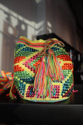
Scouting for models
THE COVER PAGE
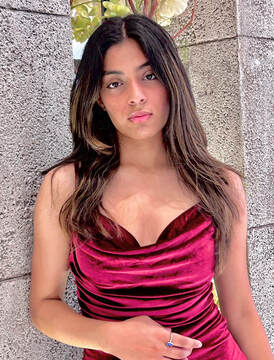
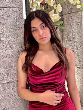
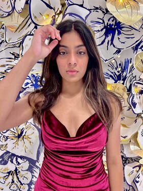
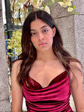
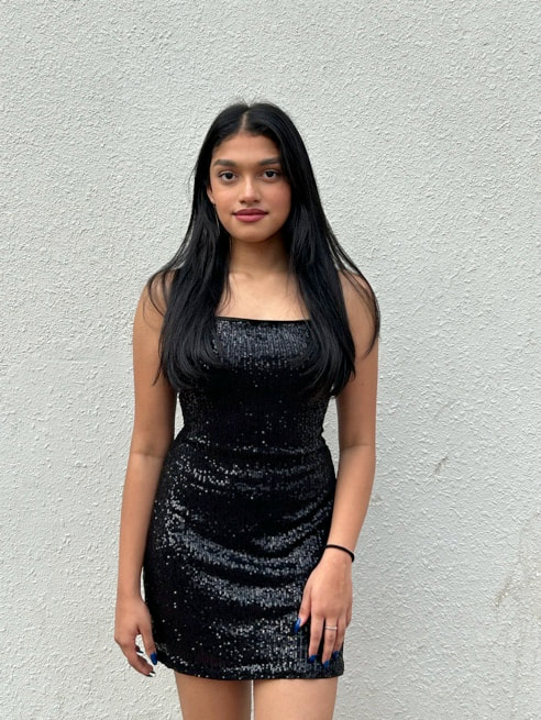
first pictures i took
I was originally thinking of using one of these pictures as my cover page, but the lighting was not great and something was off.
|
|
|
|
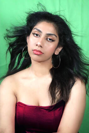
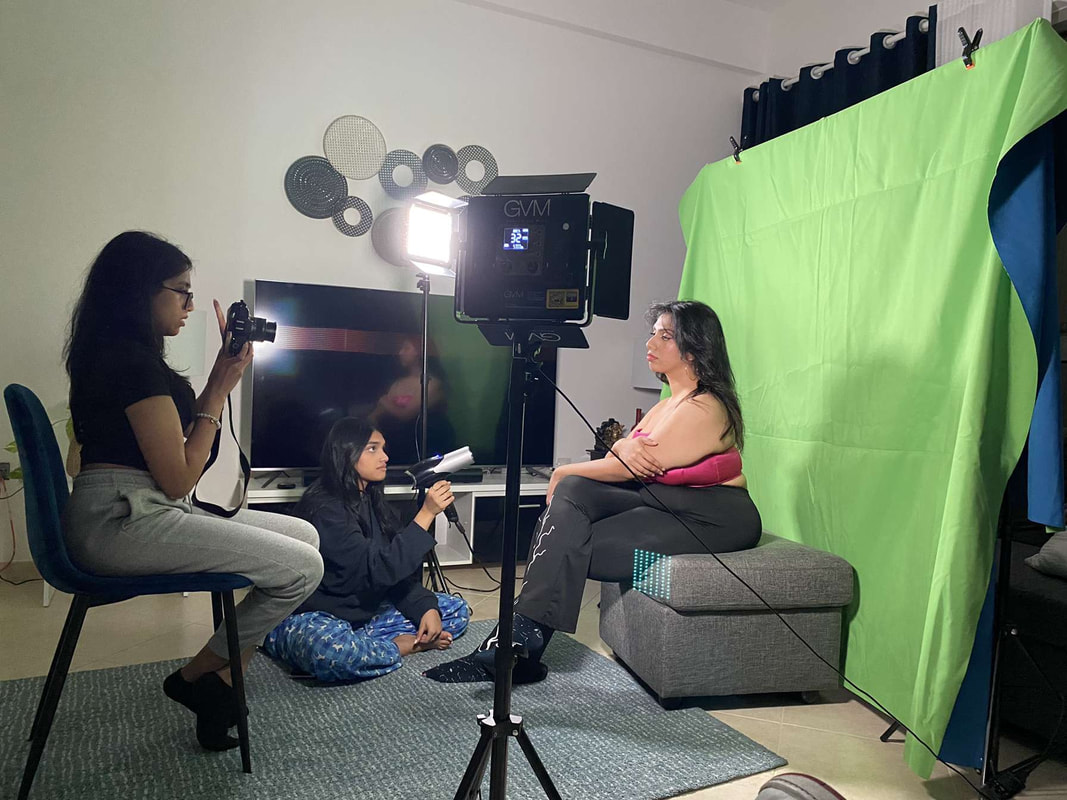
Then I decided to switch up my model because the current model (Diva) was not free for a reshoot which put me in a stumble but then I was able to get Mandira to model last minute but this time I decided to do an actual shoot with the green screen and lighting kit which turned out much better.
|
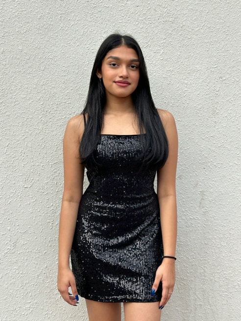
Original picture without any editing
done to it 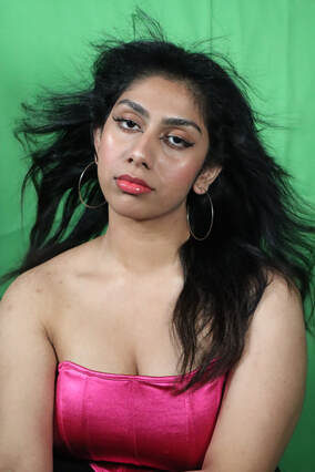
|
Using picsart to smooth out any blemishes and change the color of the top
|
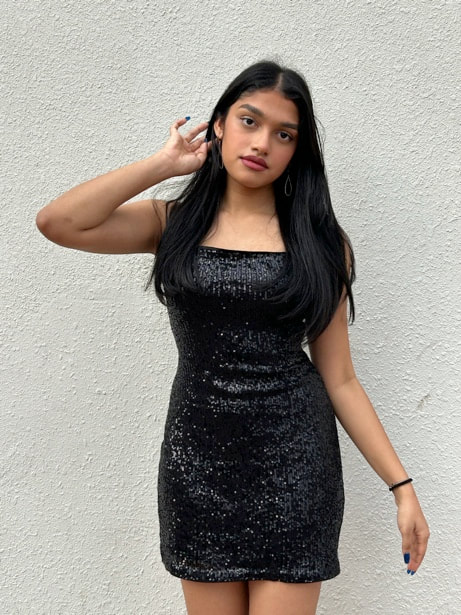
Final edit using
photoshop! 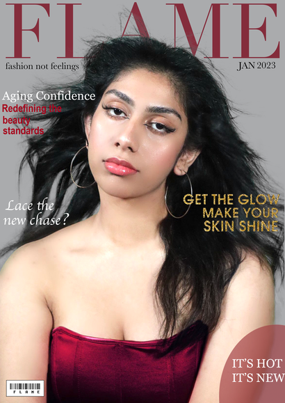
|
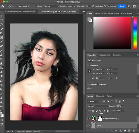
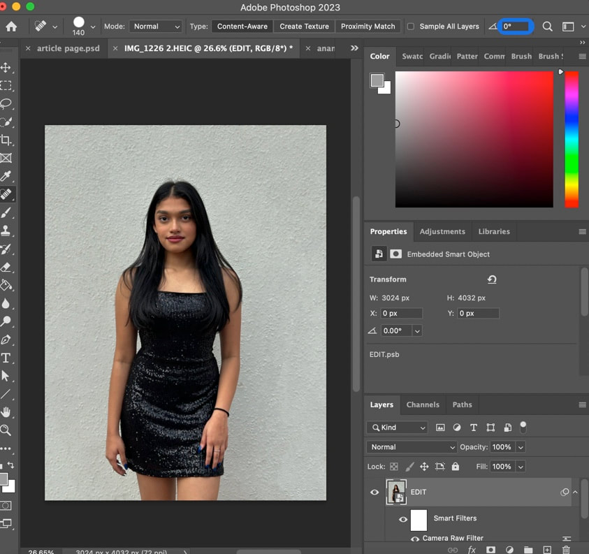
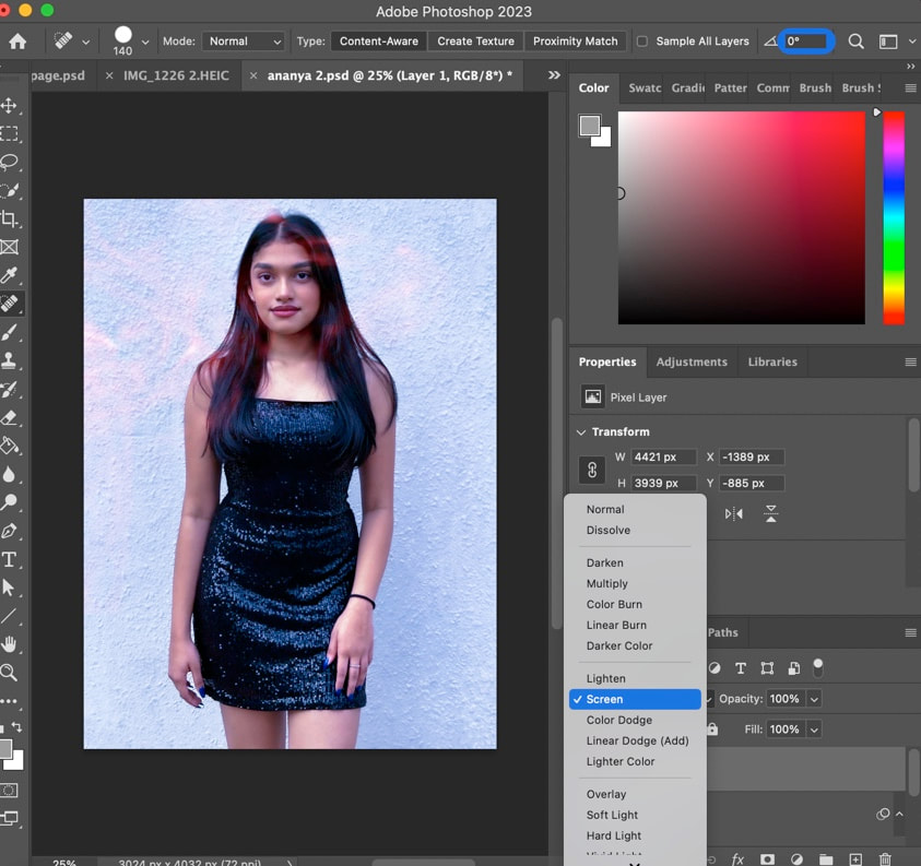
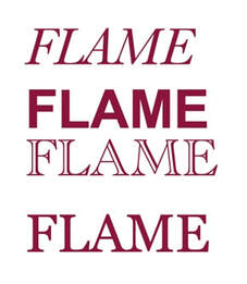
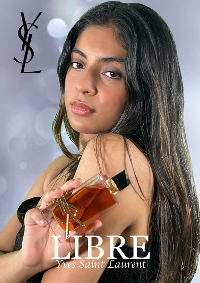
The title of the magazine is FLAME and I utilized the Didot font to create that classy look with the red color. As for the editing part, editing out the green screen was definately the tough part.
|
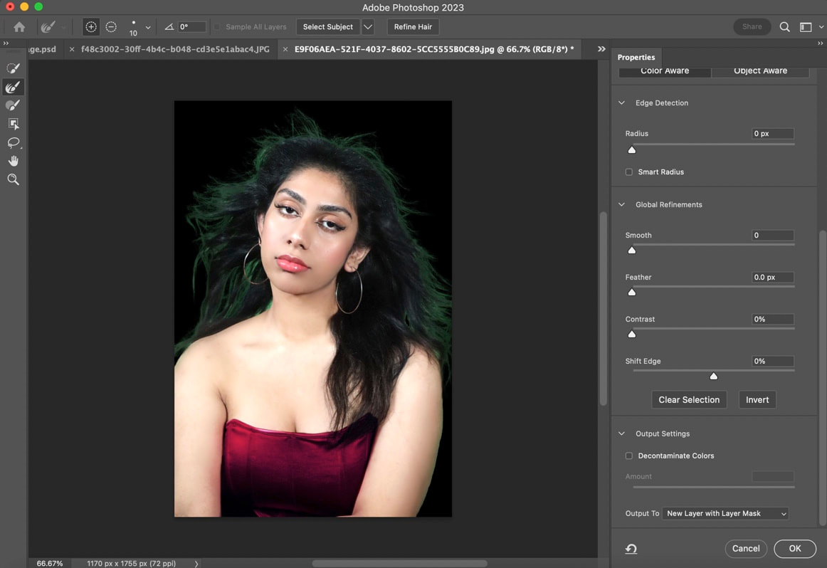
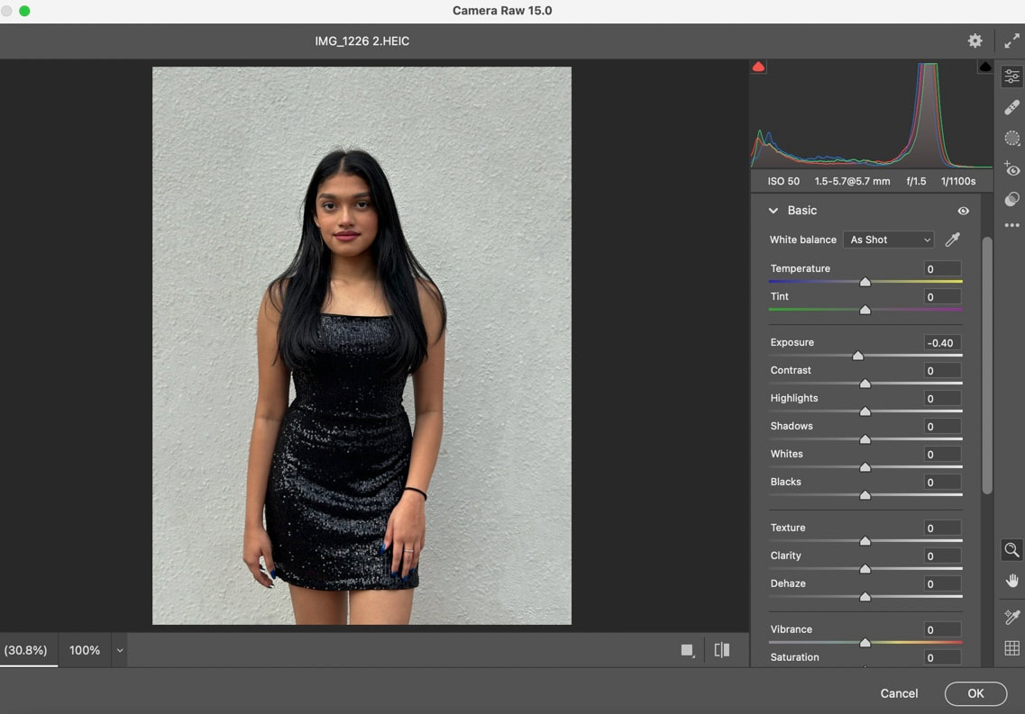
STEP 1(remove the green screen): I opened the image on photoshop then used the quick selection tool to select the subject. Then I selected and masked the image. Then refined the hair and output to, new layer with new mask.
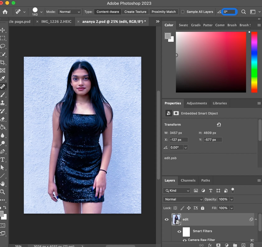
STEP 3: Create a new A4 size document (as that was the size I wanted my entire magazine to be). Then I dragged the layers from the edited image to the new document and then added a new layer and moved it below the background copy and used a paint bucket tool to add the color grey to the background.
|
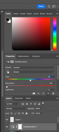
STEP 2: Then I had to make sure all the green could not be seen on the image. So I adjusted the hue/saturation to only the greens saturation be -100.
STEP 4: Finally I added all the texts and changed the fonts, the styles I used were Didot for the masthead, Baskerville, Georgia, Arial Narrow and Apple Chancery. However for the gold text I used a glitter font generator on google which typed out my text as an image shown below.
|
AND this is the final product!

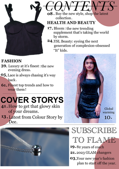
THE CONTENTS PAGE
After figuring out how to use the camera and green screen, this made making the contents page and the rest of the pages of my magazine so much easier.
|
|
|
After this shoot I got a little worried that the shots were not magazine worthy but then I decided to make it work and try editing the shot.
So I selected the third picture because I really liked the model's facial expression and pose. Here's how the editing went!
|
First steps:
Third steps:
|
Second steps:
Fourth step:
|
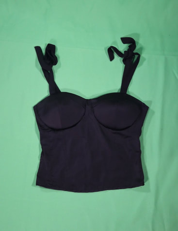
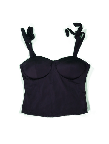
Next came editing the t-shirt for the page
As for the top I removed the green screen from the top which I had done the same for the model on the cover page. Then I dragged the image onto the A4 size document of the contents page. Below is a before and after of removing the green screen
|
|
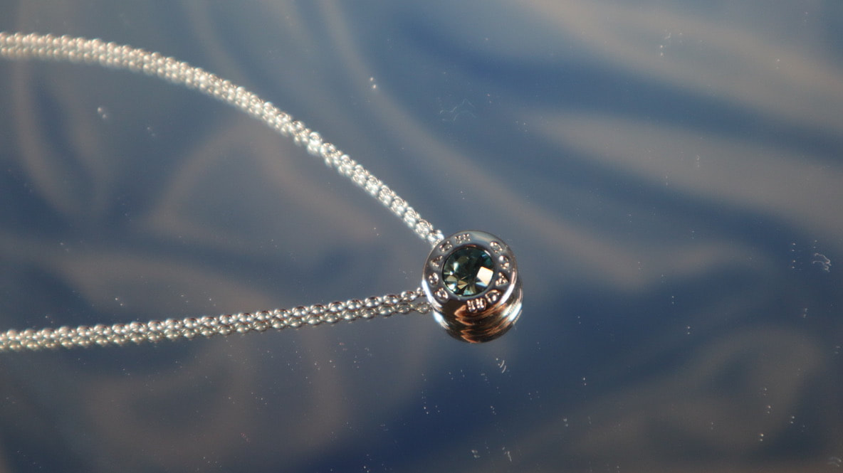
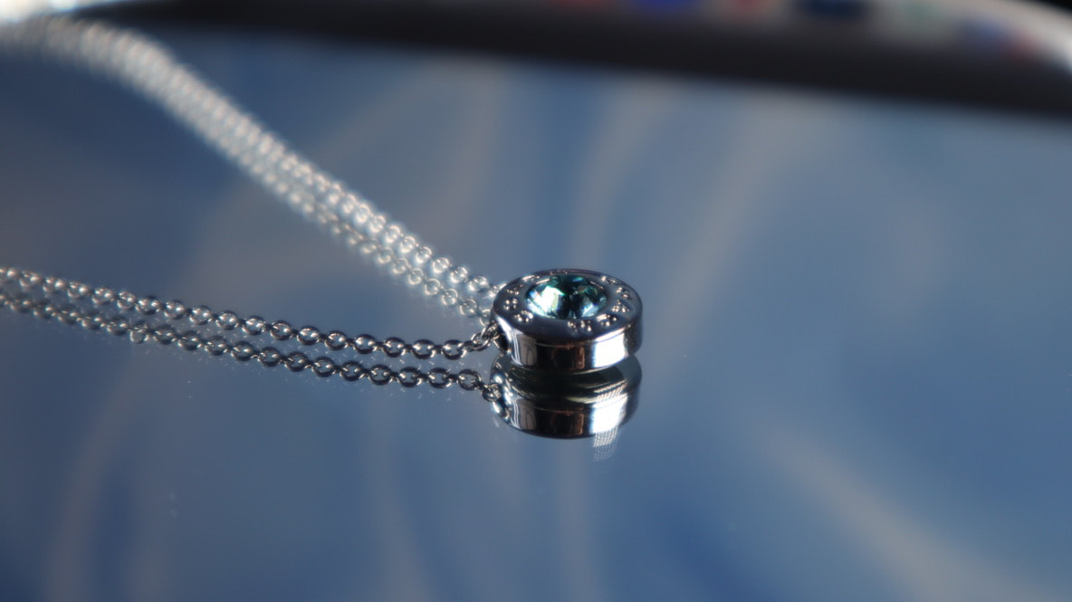
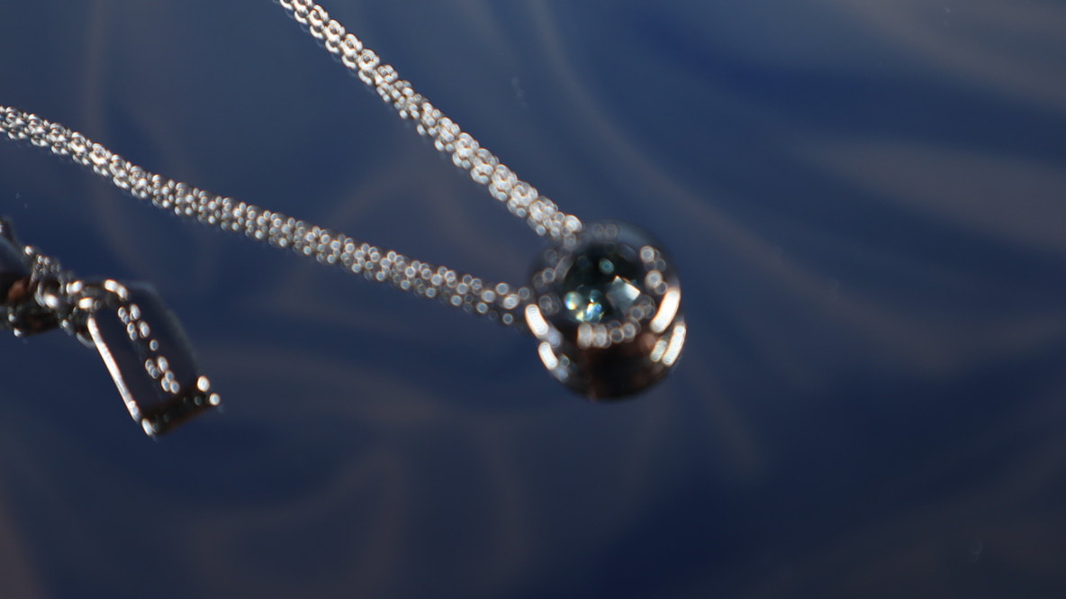
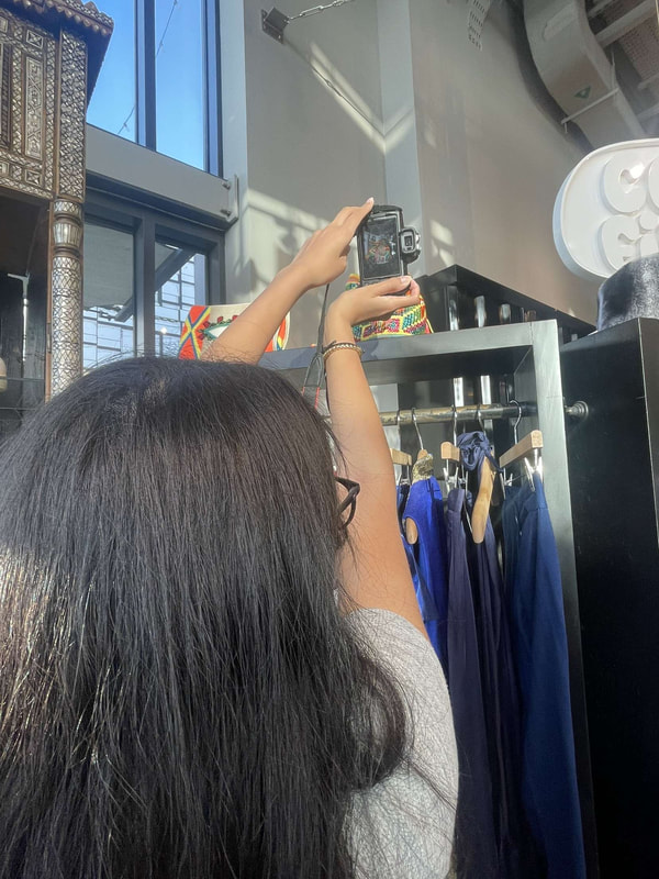
The shot of the necklace
This was probably the most fun shot considering it is just a necklace. For this shot I utilized my laptop a camera, lighting kit, mirror and the necklace. Below is a bit from behind the scenes. Below are different shots I took but I ended up loving the second one!
|
|
|
FONTS
|
|
Lastly, I wanted the the contents page to look more vibrant so I edited some circles and placed them on the edges of the page to add dimension. Aswell as some lines to separate the different categories in the magazine.
final product!
ARTICLE PAGE
I created the article page on photoshop. First I opened an A4 size document and started from there.
|
FONTS:
|
|
|
|
|
the ad
|
STEPS:
FONTS:
As for the YSL logo I found a transparent image online and repeated the same process with the background image. |
|
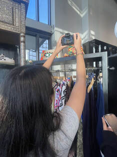
BEHIND THE SCENES
|
|
|
ALL the equipment i used
- camera (including the phone camera)
- green screen
-lighting kit
- green screen
-lighting kit
