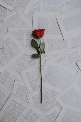
I have always loved flipping through fashion magazines when I was younger. So being able to create one of my own just feels amazing. Hence I chose fashion as the topic of my magazine. The jewelry and outfits really fascinated me.
MAGAZINES THAT INSPIRED ME
There are so many magazine companies out there such as the ones mentioned below:
|
|
|
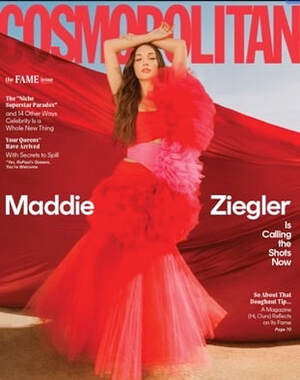
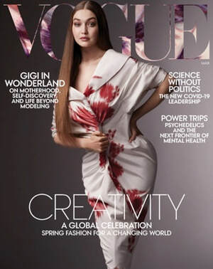
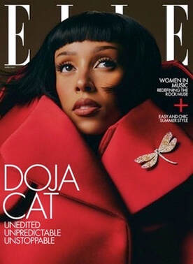
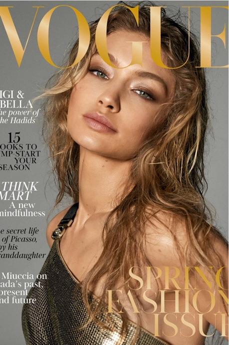
However the magazine company that caught my attention is VOGUE. VOGUE is an American monthly fashion and lifestyle magazine that covers many topics, including haute couture fashion, beauty, culture, living, and runway. Vogue became known for its distinctive photographs and high editorial quality. They produce covers for the magazine that were consistently sophisticated and occasionally revolutionary. I wanted my magazine to represent a similar sophisticated effect.
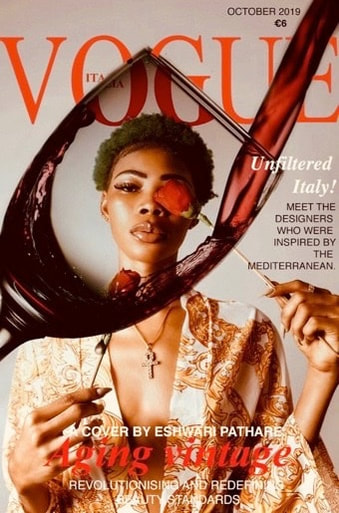
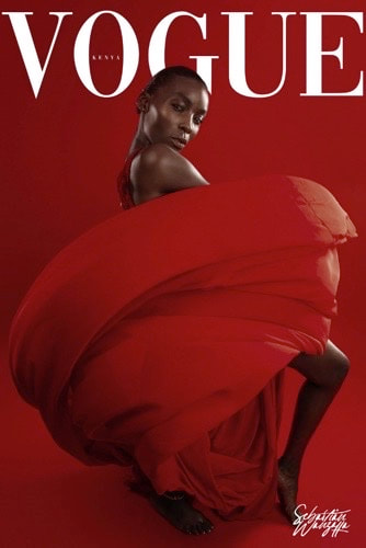
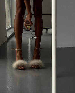
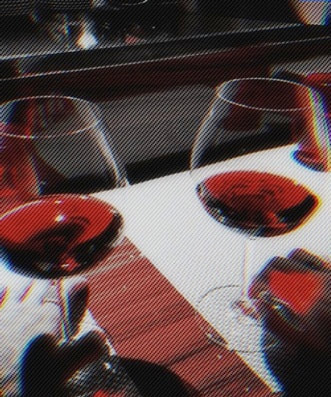
MY MAIN INSPIRATIONS
|
|
|
THE TYPE OF SHOTS USED IN A MAGAZINE
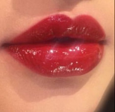
By flipping through a brunch of magazines and gaining an idea from online resources I noticed that a lot of major media companies such as VOGUE (as u can see from the examples above) utilize close up shots as the cover for a magazine. This is because it is used to draw attention to the object by zooming in on its details and highlighting them. It’s also a great way to showcase detail that may not be visible at a distance. I found this method of a close up shot really helpful to showcase the facial expression of the model to set the theme for my magazine.
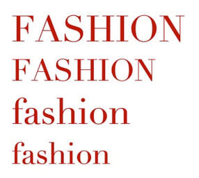
COMMON HOUSE STYLES USED IN MAGAZINES
Fonts play a major role in showcasing the theme of the magazine. The 2 main areas where fonts are used are on the cover page and the body text of the magazine. What fonts are appropriate for a fashion magazine and why are outlined below with some examples.
The masthead of a magazine:
Sometimes a traditional serif font won't convey the feel of a fashion magazine. Thats why to create an imitate the classic, elegant type look, companies like VOGUE use a neoclassical font which is Didot.
Body text of a magazine:
Serif fonts, such as Times New Roman or Cambria, are usually preferred in long passages of text because the serifs help the eye travel along the line quicker. Sans serif fonts, such as Arial and Verdana, may be a good choice if you want your magazine to exhibit a more liberal or modern design approach.
|
Examples:
|
|
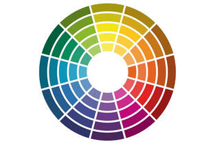
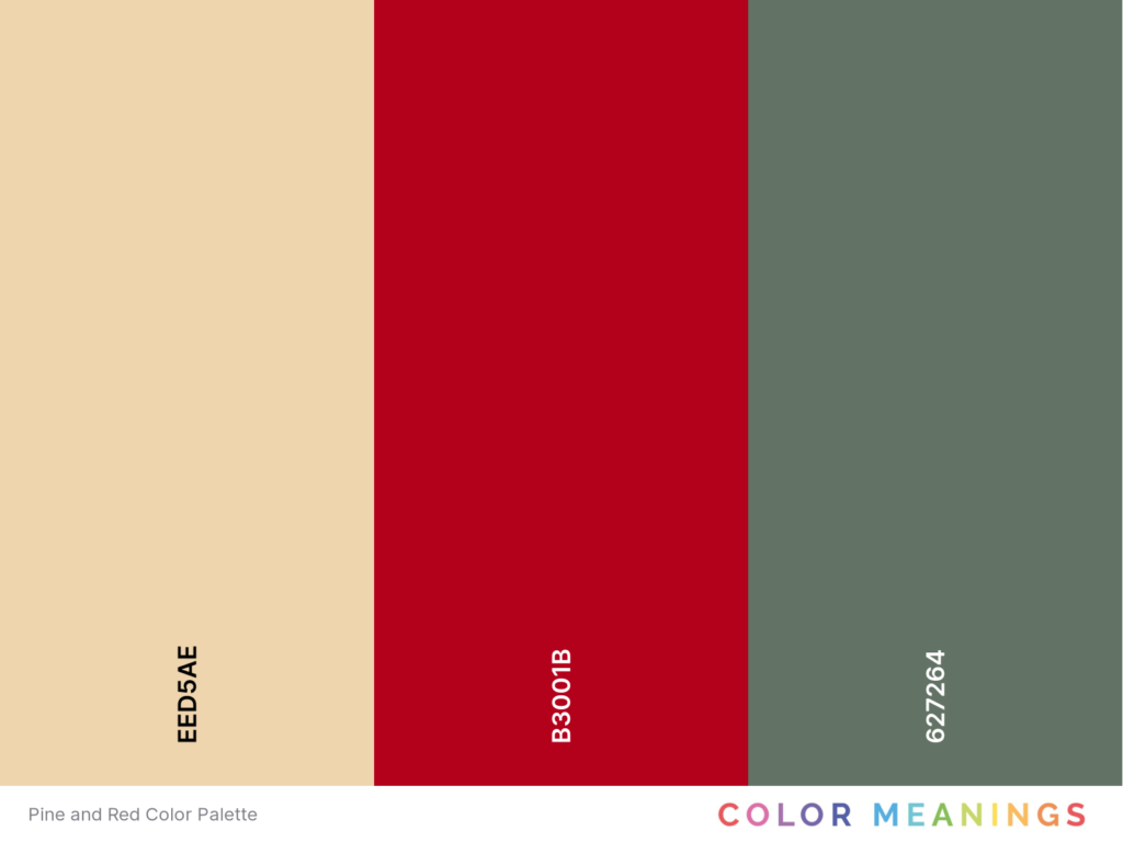
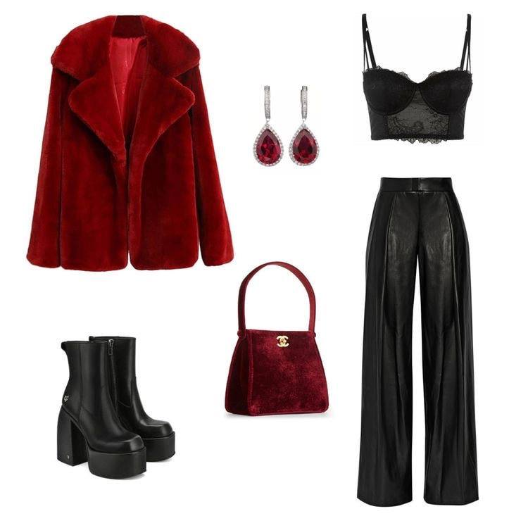
COLOUR BOARD
|
|
|
The main color theme of my magazine is red with hints of black and blue. Blue is a color that compliments red and stands out.
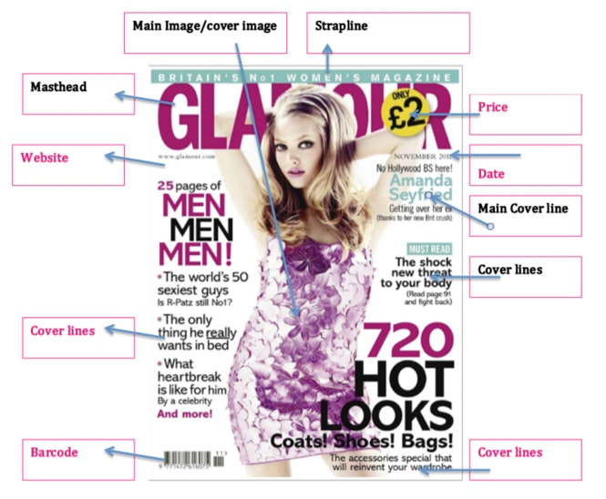
CODES AND CONVENTIONS
|
Magazine covers use codes and conventions such as:
Without utilizing these codes and conventions the magazine won't be a magazine. All these codes and conventions are linked, without one of them the magazine will look incomplete making each one important! |
|
MY TARGET AUDIENCE:
With a lot of research done, fashion magazines are highly targeted to the age group of 20-40 to make them aware of the latest fashion and beauty trends. For example: Vogue's target audience is a group of young women aged 20-40 years. People magazine's target audience is women between the ages of eighteen and thirty-two. Therefore my target audience is most likely going to be young adults from the age of 18 to 30. |
|
|
FLAME |
The name of the magazine is FLAME. My team and I came up with this name because it means something to each of us. To me it denotes passion. Passion is something I go by, passion is a reason why we all thrive to do things we love.
Fashion not feelings is the tagline, it is what we were thinking of when we reached the name FLAME. I have included it in my magazine. It means that what we wear doesn't represent how we feel. For example, for example is someone wears a bright outfit, that doesn't mean that they are happy in that moment, it could just mean that they love to wear bright outfits. It's a way of saying, wear what you want because people make assumptions about you either way so it doesn't really matter what you are wearing. |
WHAT I WANT TO INCLUDE IN MY MAGAZINE
- A cover page with a close up shot of my model to highlight facial expression
- Contents page
- A collage of photos to showcase the clothes
- Interview with a fashion designer based in Dubai
- Advertisement (Libre perfume)
- Contents page
- A collage of photos to showcase the clothes
- Interview with a fashion designer based in Dubai
- Advertisement (Libre perfume)
FOR THE INTERVIEW
It took me a long time to find the perfect candidate for this interview. After I went through a lot of options I came across Deepti Khanna. She is based in Dubai and has her own clothing store called Color Store by Dee. You will see the process in the production stage.
MOOD BOARD
|
|
|
